Customs Homepage Refresh
My Role: Lead Designer: UX + UI + Digital Art Direction
View the active site here.
The Problem
• Users weren’t scrolling or using index to see all marketing stories on the right side
• Negative space between stories contributed to a long scroll
• Page is too busy and users weren’t understanding how to use the page
• To save on dev time, I needed to maintain the split screen layout on desktop
• Banner sizes needed to stay the same because future assets were already created
The Process
• Ideate on how the ideal page would function
• Wireframe the ideal page and a stripped down version that would solve some immediate problems
• Iterate different versions and instances
The Solution
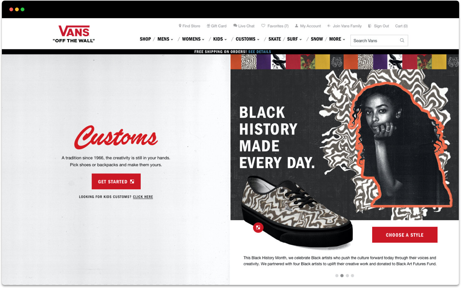
• Since users read from left to right, I put the main call to action on the left side
• Lightened up the background to make the page feel less busy
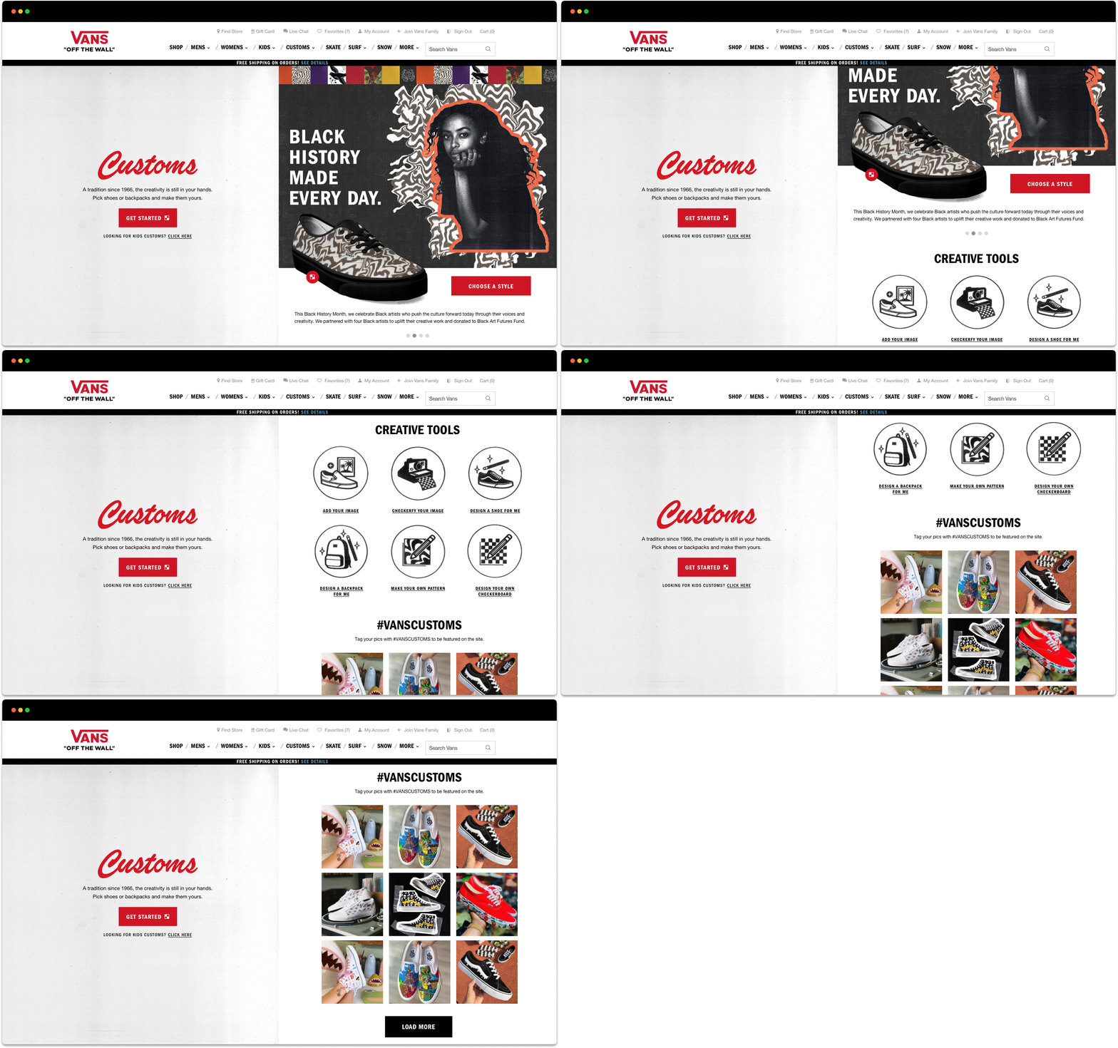
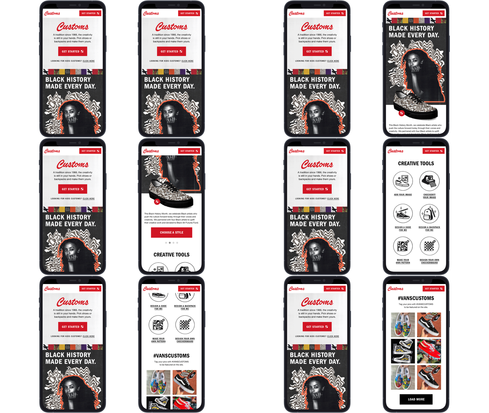
• Created a rotating carousel on the right side that rotates automatically and manually
• Auto rotate pauses when users interact with the shoe
• “Buy Now” and “Customize” options appear on shoe hover
• Added a “Creative Tools” section to highlight tools lost in the nav
• Cleaned up Olapic/social section
Results:
• +30% increase in story click rate
• +8.3% increase in recipe visit rate (Customizer with pattern)
• +165% increase in creative tools visit rate


